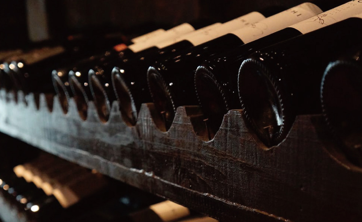
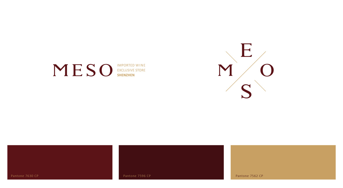
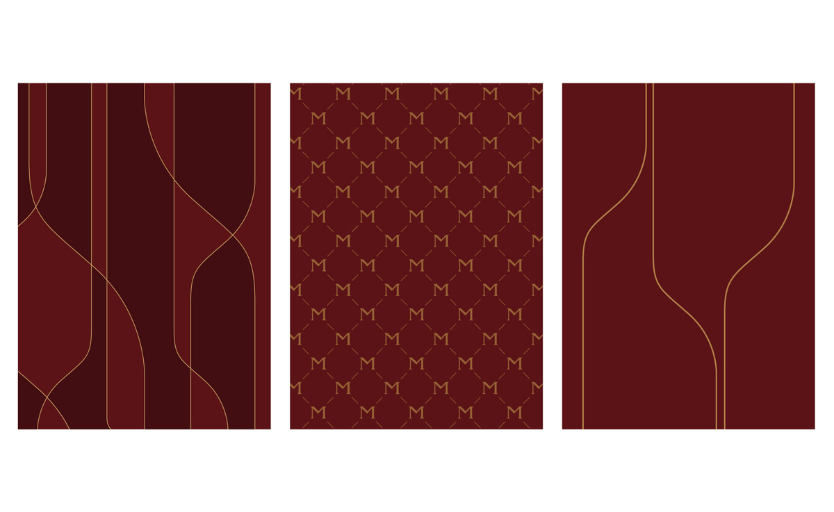
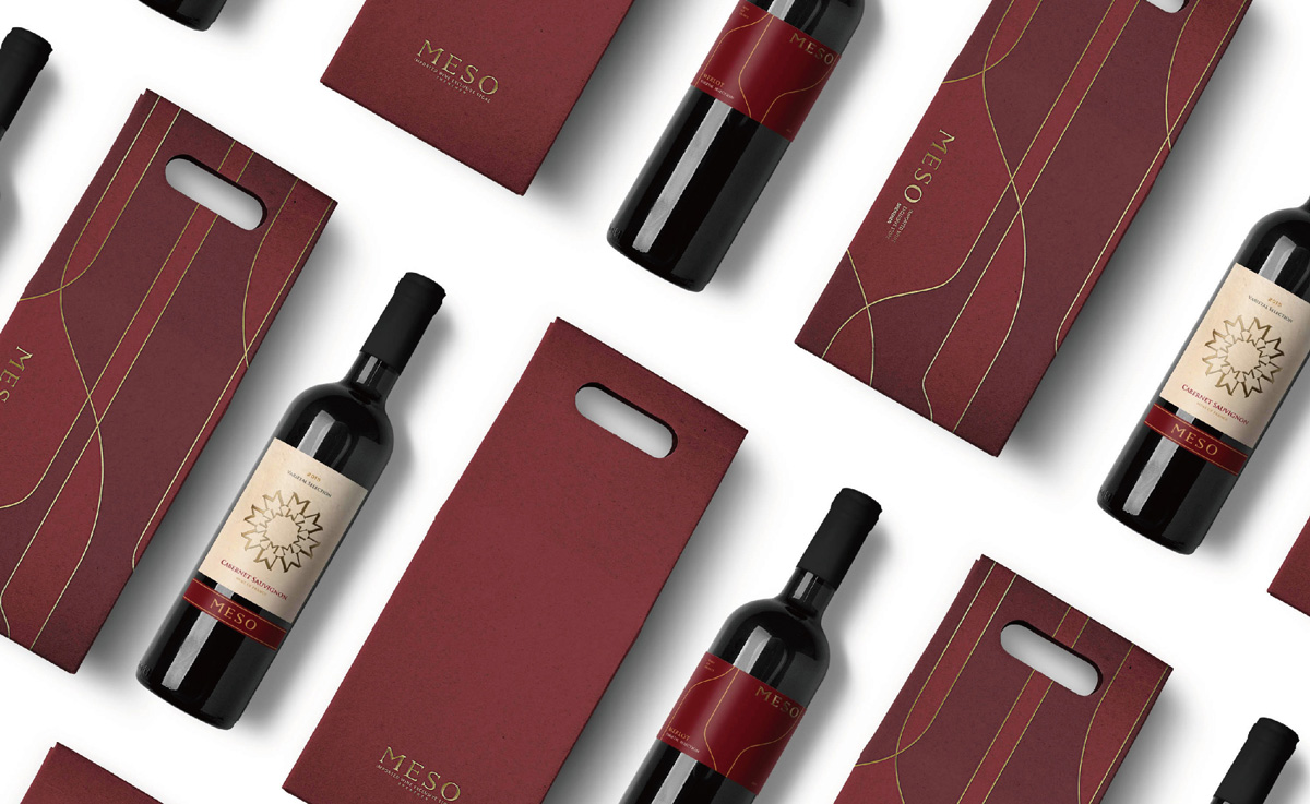
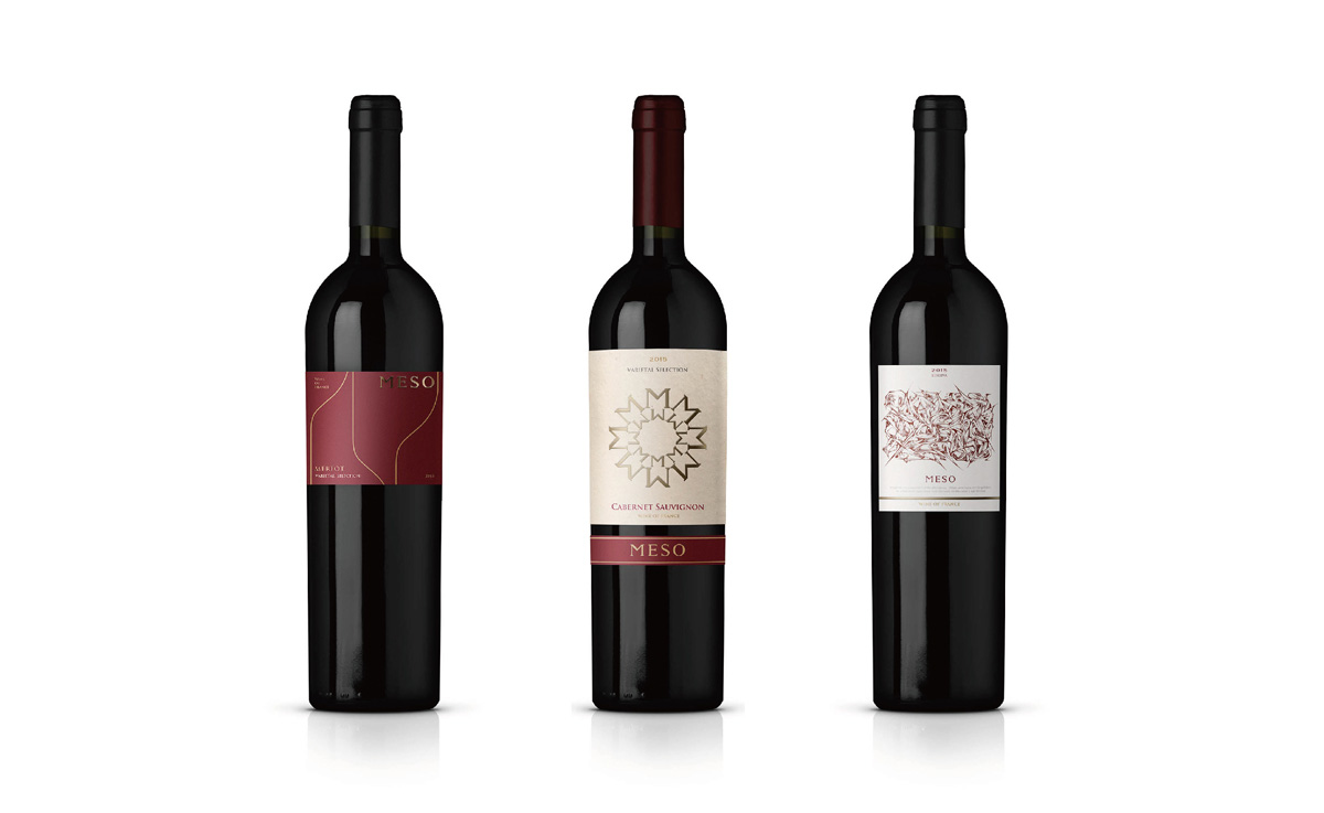
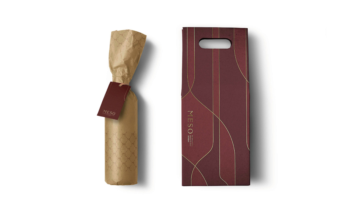
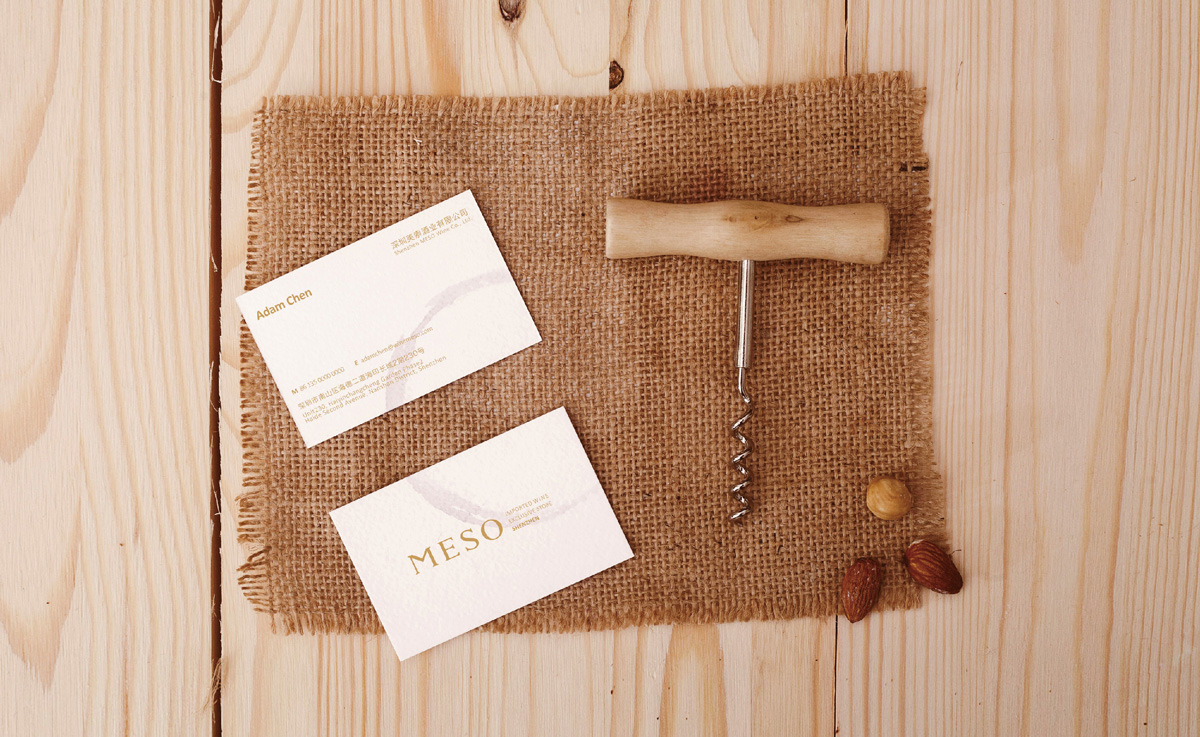
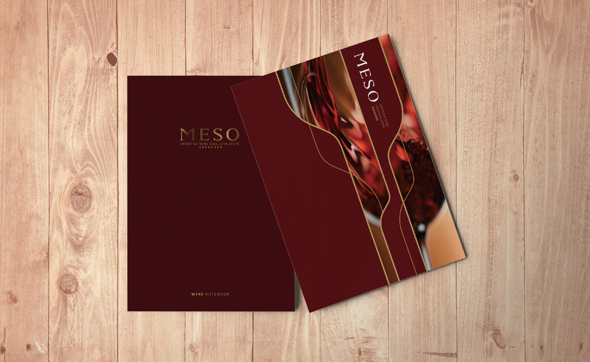
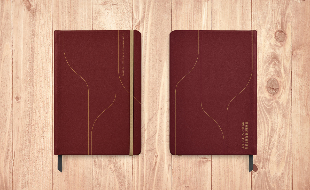
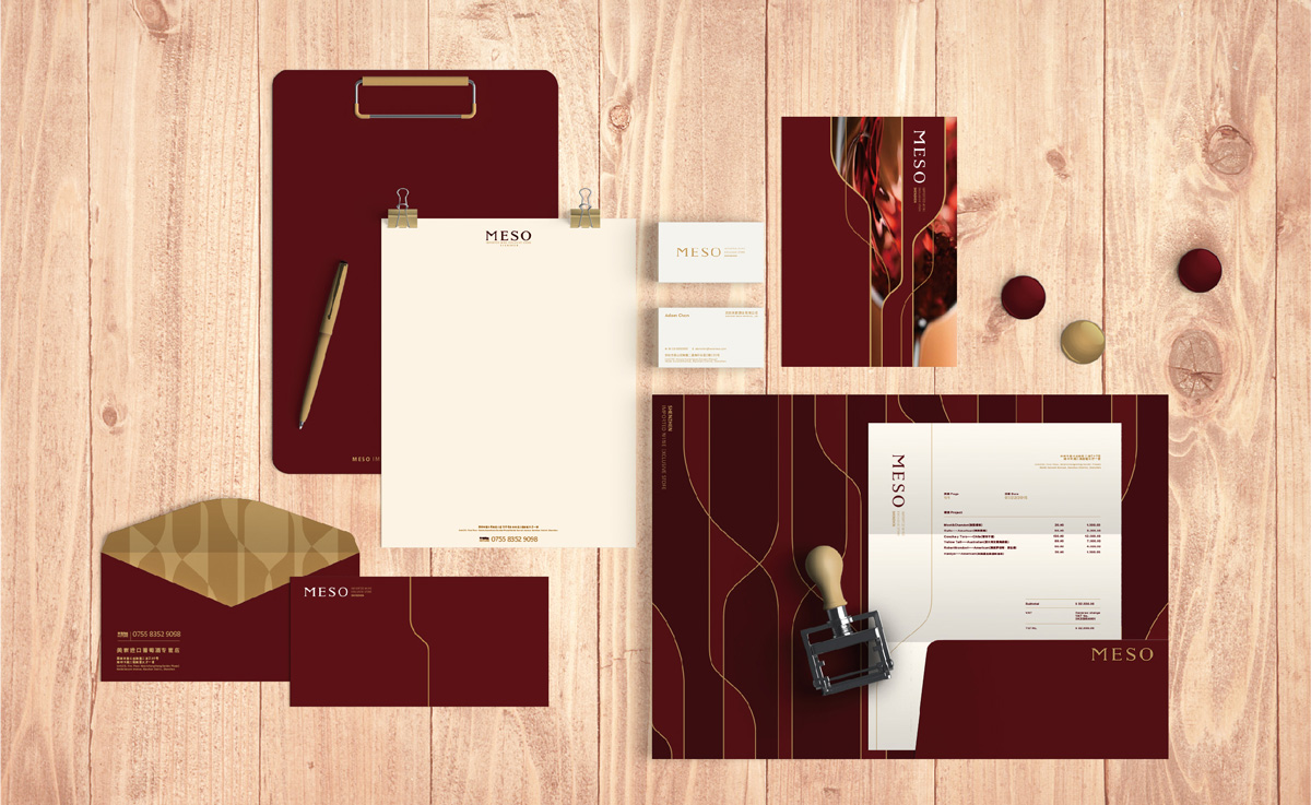
在众多的经销商竞争中,消费者的需求下,打造一个以经典为基础现代化视觉的品牌形象。美索——美索不达米亚,是红酒发源地之一,MESO标志以字体为形象,保留了对红酒历史的气息;红酒的瓶身与杯子的体型为MESO品牌的主要视觉图形,以线条、色块的形式交替使用。通过经典手法修饰主标志与对应行业属性的视觉图形,呈现MESO高端与时尚的结合,能对消费者在众多选择中体验红酒的文化。
In a large number of dealer competition, consumer demand, to create a classic-based modern visual brand image. MESO - Mesopotamia, is one of the birthplace of red wine. The main logo of the MESO retains its breath of red wine history; the body of the bottle and cup of red wine are the main visual patterns of the MESO brand and are alternately used in the form of lines and patches. Through the classic approach to modify the main logo and the visual attributes of the corresponding industry graphics, showing the combination of high-end MESO and fashion. Through MESO, consumers can experience the wine culture among many choices.

Branding, Graphic, Package
品牌形象、圖形、包裝
December
2015.12
Meso Wine Store
美索酒業